In this JupyterLab Python notebook we are going to look at the rate of coronavirus [COVID-19] cases in french departments [administrative divisions of France]. The data source is the french government's open data.
We are going to perform a few operations, such has filtering some data, pivoting some tables, smoothing time series with a rolling window or plotting an heatmap.
Disclaimer : although we are going to use some COVID-19 data in this notebook, I want the reader to know that I have ABSOLUTELY no knowledge in epidemiology or any medicine-related subject. The point of this post is not COVID-19 at all but only to show an application of the Python data stack.
Imports
import pandas as pd
import matplotlib.pyplot as plt
import seaborn as sns
import colorcet as cc

FS = (16, 8)  # figure size
Loading the data
We load the data from an URL straight to a pandas DataFrame:
tests = pd.read_csv(
    "https://www.data.gouv.fr/fr/datasets/r/406c6a23-e283-4300-9484-54e78c8ae675",
    sep=";",
    low_memory=False,
)
tests.head(2)| dep | jour | P | T | cl_age90 | pop | |
|---|---|---|---|---|---|---|
| 0 | 01 | 2020-05-13 | 0 | 16 | 9 | 83001.0 |
| 1 | 01 | 2020-05-13 | 1 | 17 | 19 | 84665.0 |
We have 6 columns here:
dep: department's codejour: dateP: number of positive tests per dayT: number of tests per daycl_age90: age grouppop: population corresponding to an age group and a department
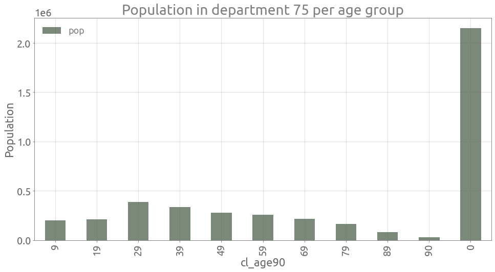
We have 11 age group values, however 0 gathers all age groups:
tests.cl_age90.unique().tolist()[9, 19, 29, 39, 49, 59, 69, 79, 89, 90, 0]For example in Paris, we have:
depnum = "75"
pop_paris = (
    tests[tests.dep == depnum][["cl_age90", "pop"]]
    .drop_duplicates()
    .set_index("cl_age90")
)
ax = pop_paris.plot.bar(figsize=FS, alpha=0.6)
ax.grid()
_ = ax.set(
    title=f"Population in department {depnum} per age group", ylabel="Population",
)
assert (
    pop_paris[pop_paris.index > 0].sum().values[0]
    == pop_paris[pop_paris.index == 0].values[0][0]
)
We start by creating a DatetimeIndex:
tests.jour = pd.to_datetime(tests.jour, format="%Y-%m-%d")
tests.set_index("jour", inplace=True)
tests.index.name = "Date"
tests.head(2)| dep | P | T | cl_age90 | pop | |
|---|---|---|---|---|---|
| Date | |||||
| 2020-05-13 | 01 | 0 | 16 | 9 | 83001.0 |
| 2020-05-13 | 01 | 1 | 17 | 19 | 84665.0 |
COVID-19 and test rates in the Rhône department
Now we select a department [Rhône department with code 69]:
depnum = "69"
dep_tot = tests[(tests.dep == depnum) & (tests.cl_age90 == 0)].copy(deep=True)
dep_tot.drop(["dep", "cl_age90"], axis=1, inplace=True)
dep_tot.head(2)| P | T | pop | |
|---|---|---|---|
| Date | |||
| 2020-05-13 | 20 | 1468 | 1876051.0 |
| 2020-05-14 | 41 | 1531 | 1876051.0 |
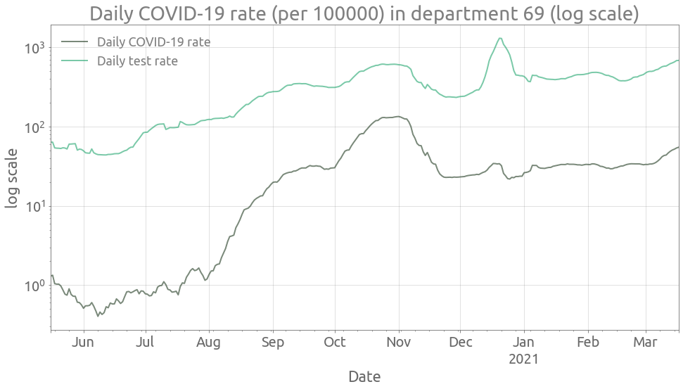
We can now compute and plot the COVID-19 rate for all age groups in this department:
ax = (
    (100000 * dep_tot.P / dep_tot["pop"])
    .rolling(7, center=True)
    .mean()
    .plot(style="-", figsize=FS, logy=True, alpha=0.6)
)
ax = (
    (100000 * dep_tot["T"] / dep_tot["pop"])
    .rolling(7, center=True)
    .mean()
    .plot(style="-", ax=ax, logy=True, alpha=0.6)
)
ax.grid()
_ = ax.set(
    title=f"Daily COVID-19 rate (per 100000) in department {depnum} (log scale)",
    ylabel="log scale",
)
_ = ax.legend(["Daily COVID-19 rate", "Daily test rate"])
ax.autoscale(enable=True, axis="x", tight=True)
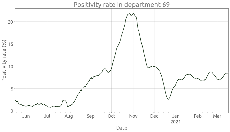
We can also show the positivity rate:
ax = (100 * dep_tot.P / dep_tot["T"]).rolling(7, center=True).mean().plot(figsize=FS)
ax.grid()
_ = ax.set(
    title=f"Positivity rate in department {depnum}", ylabel="Positivity rate (%)",
)
ax.autoscale(enable=True, axis="x", tight=True)
Departement with the worst COVID-19 rate
First we need to select departments with a rather large population size [at least 50000 inhabitants for example] in order to compute a significative rate per 100000. Here is the population per department:
pop = (
    tests[tests.cl_age90 == 0][["dep", "pop"]]
    .drop_duplicates()
    .sort_values(by="pop")
    .reset_index(drop=True)
)
pop.head()| dep | pop | |
|---|---|---|
| 0 | 975 | 5997.0 |
| 1 | 977 | 9961.0 |
| 2 | 978 | 35334.0 |
| 3 | 48 | 76286.0 |
| 4 | 23 | 116270.0 |
We create a list of departments with population above a threshold value:
pop_th = 50000
large_deps = pop[pop["pop"] > pop_th].dep.values.tolist()
Now we pivot the table such that each column corresponds to a department:
cr_alldep = tests[tests.cl_age90 == 0][["dep", "P", "pop"]]
cr_alldep["cr"] = 100000 * cr_alldep.P / cr_alldep["pop"]
cr_alldep.drop(["pop", "P"], axis=1, inplace=True)
cr_alldep = cr_alldep.pivot_table(index="Date", columns="dep", values="cr")
cr_alldep = cr_alldep[
    large_deps
]  # Here we select the largest departments regarding population
cr_alldep.head(2)| dep | 48 | 23 | ... | 75 | 59 |
|---|---|---|---|---|---|
| Date | |||||
| 2020-05-13 | 0.0 | 0.860067 | ... | 1.768864 | 1.390505 |
| 2020-05-14 | 0.0 | 0.860067 | ... | 2.606747 | 1.622255 |
2 rows × 102 columns
Let's look at the 5 departments with the highest COVID-19 rate in the most recent days:
n_deps = 5
deps = (
    cr_alldep.rolling(7, center=True)
    .mean()
    .dropna()
    .iloc[-1]
    .sort_values(ascending=False)[:n_deps]
    .index.values.tolist()
)
deps
['93', '95', '94', '77', '75']We can now plot the evolution of the COVID-19 rate in these 5 most affected departments:
highest_cr = cr_alldep[deps]
ax = highest_cr.rolling(7, center=True).mean().plot(figsize=FS, alpha=0.6)
ax.grid()
_ = ax.set(
    title="Daily COVID-19 rate (per 100000) in the most affected departments",
    ylabel="COVID-19 rate",
)
ax.autoscale(enable=True, axis="x", tight=True)
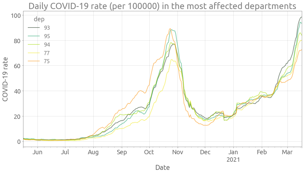
Now we are going to focus on the department with highest COVID-19 rate.
Heatmap of the COVID-19 rate by age group in the most affected department
We start by pivoting the table such that each column corresponds to an age group:
depnum = deps[0]
dep_ag = tests[(tests.dep == depnum) & (tests.cl_age90 != 0)].copy(deep=True)
dep_ag["cr"] = 100000 * dep_ag.P / dep_ag["pop"]
dep_ag.drop(["dep", "P", "T", "pop"], axis=1, inplace=True)
dep_ag = dep_ag.pivot_table(index="Date", columns="cl_age90", values="cr")
dep_ag.head(2)| cl_age90 | 9 | 19 | ... | 89 | 90 |
|---|---|---|---|---|---|
| Date | |||||
| 2020-05-13 | 1.160501 | 1.324369 | ... | 19.272929 | 96.936797 |
| 2020-05-14 | 0.000000 | 0.000000 | ... | 26.500277 | 9.693680 |
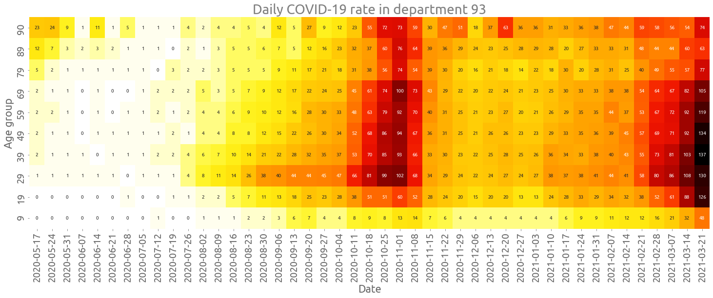
Also, we compute the weekly average and transpose the table:
cr_smooth = dep_ag.resample("W").mean().T
cr_smooth = cr_smooth.sort_index(ascending=False)
cr_smooth.columns = [t.date() for t in cr_smooth.columns]
cr_smooth.head(2)| 2020-05-17 | 2020-05-24 | ... | 2021-03-14 | 2021-03-21 | |
|---|---|---|---|---|---|
| cl_age90 | |||||
| 90 | 23.264831 | 24.926605 | ... | 54.007644 | 74.318211 |
| 89 | 12.527404 | 7.915667 | ... | 60.916221 | 63.038538 |
2 rows × 45 columns
We can now plot the heatmap:
fig, ax = plt.subplots(figsize=(25, 8))
ax = sns.heatmap(
    cr_smooth.astype(int), ax=ax, annot=True, cbar=False, fmt="d", cmap=cc.fire[::-1]
)
_ = ax.set(
    title=f"Daily COVID-19 rate in department {depnum}",
    xlabel="Date",
    ylabel="Age group",
)